2017 was a huge year for the Atlassian brand and design. We developed a new design language that touches every part of our business. It was an effort not only to change the way we embody our personality but also change the standard we hold ourselves to.
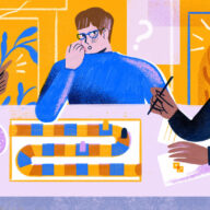
Over the past few years, our use of illustration has become more prominent. It’s a powerful tool that has the flexibility to tell whimsical, aspirational stories as well as communicate complex technical concepts that might otherwise feel overwhelming. Illustrations distinguish our voice and build a deeper emotional connection with our audience.
As part of our re-branding process, we explored Atlassian’s mission to unleash the potential in every team. What that means for us as designers is that we need to depict those teams – which means depicting the people comprising them. And since we know that the best teams are diverse and inclusive, we felt this was a unique opportunity to celebrate the diversity in the teams we serve – especially at a time when 80% of high-skilled workers say that inclusive workplaces are important to them.
The process of progress
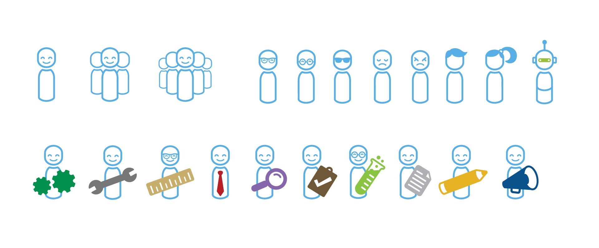
We’ve used illustrated characters, which we call “meeples”, to tell our story for a long time. In fact, we’ve been on this journey for several years. Originally, meeples were used as graphic devices to tell stories about different people in different roles. They were humanoid, but not quite human. They didn’t yet have realistic features that could represent the diversity of all team members, only simple props that indicated their functions. (Bonus points to anyone who can determine the role of the meeple second from the left.)
As you can see, this was not an effort in making our audience feel represented. These purely functional illustrations downplayed diversity by abstracting people beyond recognition.
Our next iteration added a bit more character, but not much. Gender expression was shown only through two hairstyle options, and the default bald meeple appeared male. Certain stereotypes were being reinforced, such as a tie (a traditionally male item) being used to denote a business person or manager. Skin tones were still “absent”, effectively making these characters white as a result.
The more realistic details we added, the more obvious the lack of representation became. We weren’t doing a great job of representing our own team, let alone all of the teams in the world. Our next iteration of meeples was more varied in gender and clothing, but this made the absence of varied skin tones and the binary approach to gender all the more apparent. It was a naïve maneuver to avoid disrupting our fragile color palette – which, in hindsight, we were overly reliant on to carry the look and feel of our brand.
It was becoming painfully obvious that by attempting to avoid a discussion around inclusion, we were actually developing habits that we needed to break. We started by making room in our brand language for an expanded color palette to include different skin tones.
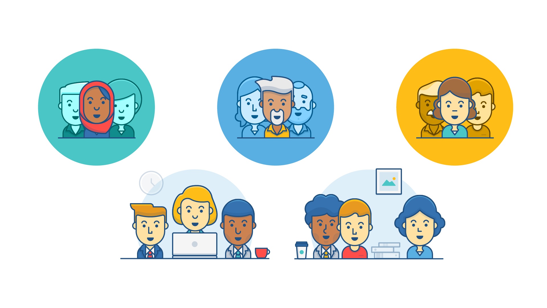
Teams are diverse. If we wanted to represent them, we needed to acknowledge that. What came next was a well-intentioned but somewhat shallow approach to diverse representation. This included a checked box approach to skin color (light, medium, dark), roles that were implied by apparel, and the inclusion of a few religious symbols.
As small as this step might seem, we were finally starting to ask difficult questions about what inclusive representation meant, even if we were far from answering them.
Our approach today
We embarked on the mission to create more inclusive imagery with the lessons from our past attempts at the top of our minds. It started with thinking about them differently. We needed to shed the tendency to simplify our audience into just a few personas. The more we enforce a limited image of our audience, the more we limit who sees themselves as an Atlassian customer, a part of the tech industry, or even a full member of their team.
Bottom line, Atlassian products are for people on teams. That shouldn’t be limited by their race, religion, gender, age, or ability. Anyone should be able to see themselves in the stories we tell.
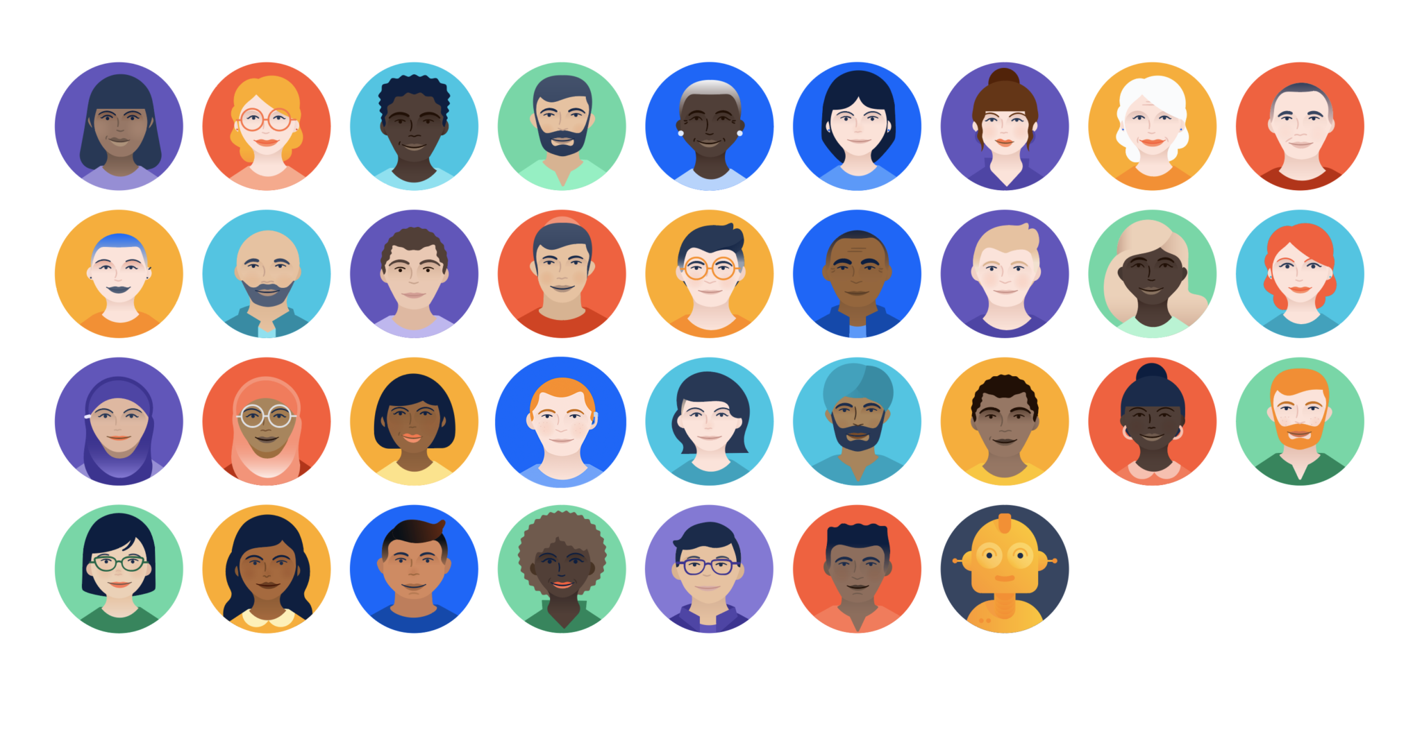
In our new spot meeples we started by widening the spectrum of skin tones, hair colors, and other features to better reflect real people. We expanded on how our meeples express gender and individuality with more hairstyles and clothing options. We added to the number of cultures and religions that can be expressed and experimented with new ways to present meeples of varying ability, starting with the addition of glasses and hearing aids.
This not only allowed us to more effectively represent people of color, but helped people of all ages, abilities, and gender identities see themselves in our brand.
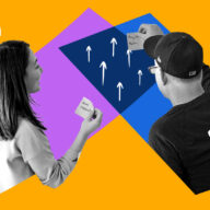
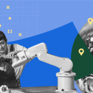
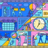
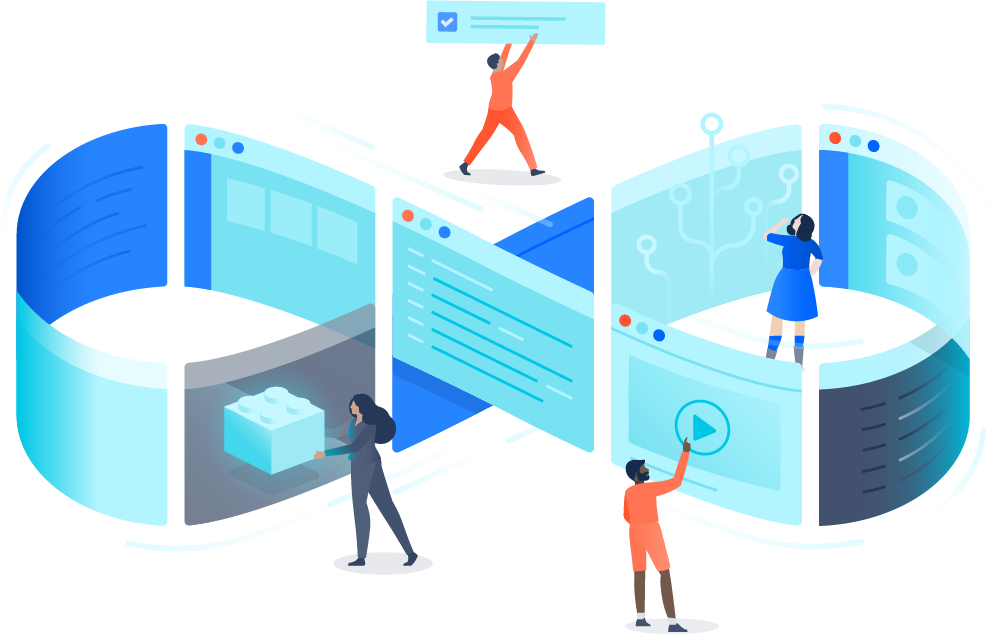
In some illustrations, we show full-bodied meeples interacting with larger-than-life environments. These visuals are usually telling more complex, metaphorical stories using a variety of different characters. The meeples used here have less facial detail but show more direct relationships between one another. This provides us a great opportunity to share a vision of inclusive teamwork, and because they are full-body figures, we had the opportunity to show more realistic range in body size and proportion.
Each one is like a mini-story and each meeple is a character within it. The roles we give to each character matter, so we take care to be conscious of the power-dynamics we create. Everyone in a scene should contribute equally. Our illustrations should promote a spirit of collaboration that includes a diverse group of people bringing their different strengths to the task at hand.
This process is not scientific, nor should it be. Becoming overly formulaic when trying to represent diversity is what led to many of our past problems. For us, creating these stories in an inclusive way is built around conversation. We share iterations with our team (which itself is very diverse) and with people outside our team and even company.
We ask how the representation in an illustration makes people feel. We make adjustments and hold ourselves and each other accountable. With the opinions we gather, we do our best to distill them into an outcome that pushes us forward. There is still a long way to go. The process can never really be finished, but we are inching our way toward something better.
Walk, run, stumble, repeat
This journey has taught us that promoting diversity and inclusion within our brand is a sustained, multi-faceted effort. We face some challenges that cannot be easily overcome. For instance, it’s hard to be a totally inclusive brand knowing that there are aspects of diversity, like invisible disabilities or neurodiversity, which can be difficult to illustrate.
It’s also a challenge to depict diversity without it feeling merely perfunctory or symbolic until the reality of our industry truly represents the customers we serve and the world at large. So much more needs to be done outside of the brand to promote an inclusive workplace. It’s not just about advancing our business, it’s about being the best member of the tech community that we can.
In the spirit of helping others in their journey, we’d like to share some tips on how you might become more aware of diversity and inclusion within your brand space, whether it’s through illustration, photography, or other mediums that deal directly with humans and how we depict them.
- Challenge assumptions of your audience early on in the design process. Don’t settle for a one-size-fits-all approach when it comes to defining who your customers are.
- If your organization prides itself on investing in inclusion, consider looking to your colleagues for inspiration. There are more than a few of our meeples that are named after our own teammates.
- Think of it as “normalizing” and making your brand representative of the real world. Fixating on “diversifying” can result in adding token characters.
- Talking to your internal customers about how they think about diversity while using brand assets. This will also inform your written design guidelines.
- Use a collection of subtle elements to indicate ethnicity. Relying too heavily on one element (like uniform eye shape for all Asian people) is the fast track to making caricatures.
- Take advantage of those in your company who are passionate about diversity and inclusion. Even with the best intentions, it’s unrealistic to assume that everyone knows how to visualize diversity in a respectful way.
- Accept change as inevitable! Be willing to constantly challenge your assumptions. Your brand will grow, and so will you.
By taking ownership of the problem, you can provide a better toolkit for marketers and designers, and also educate your entire organization on the importance of inclusive representation.
Design for diversity on and off the page
Our commitment to conveying the humanity in teamwork has only become stronger. Because our mission is to unleash the potential in every team, depicting people is especially important. How we represent the people who make up teams is just as important.
The influence of brands on society can’t be underestimated. The technology industry in particular is extremely unbalanced, and there is little doubt that a lack of representation in tech brands plays a role – if people never see themselves represented in tech branding, it’s unlikely they’d consider tech a welcoming place to work.
Redefining our illustration was not only a chance to make it a more powerful and usable tool for advancing our brand message, but to step up and become a more responsible member of our community. It’s an exciting place to be. We hope you’ll join us.
. . .
Curious about how workers like you view inclusion and belonging in the workplace? Head over to our 2018 State Of Diversity Report and find out.

